5 Tips For Posting Your Work On Instagram
Sharing your work online is a great way to reach new clients, show what you’re working on and to build a mini portfolio that is always updated. Instagram is such a great (free!) tool for showing your work but sometimes it seems like people aren’t seeing and liking what we post. Figuring out how to share your work can be tricky, but it’s super easy once you have the hand of it! Here are 5 tips for showing your work on Instagram that will help you to be effective on Instagram as an artist!
USE NATURAL LIGHT
This might seem like an obvious one, but it always blows my mind to see how many people post photos that were taken in the dark, or with weird lighting. Find a spot in your house with a window and try to avoid shadows as much as you can. Sometimes when you finish a project late at night, it can be tempting to want to post a picture of it right away, but be patient! If you wait until the next morning to take a picture when the lighting is better, you will be so much happier with the results.
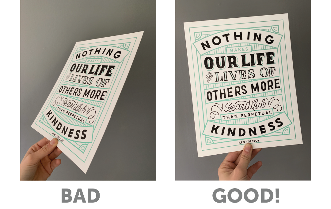
2. SHOW THE WORK HEAD ON
When showing your work, always try to take pictures that show the work head-on rather than at an angle. As an artist, you always want to present your work in the best way possible, and this is a simple quick way to make sure people are looking at your work in the way that it was intended to be seen.
3. GIVE YOUR WORK CONTEXT, TELL A STORY
Instead of just showing a picture of your work on a plain background, try to put it in context and to tell a story with your image. There are a couple ways to do this. The first is setting. Take your photo in a setting that either has something to do with the artwork, or shows the process. For instance, in the photo below, I’m showing that I drew the illustration by hand using my iPad and giving people an idea of what my workspace looks like. This is much more interesting than if I had just posted a close up of the image itself. The next way to add context is with tools and props. In the other example, I was taking a picture of a birthday card that I designed that talks about money, so I added money to the background to reinforce the meaning of the card. By using tools and prompts you send a visual message of what the work is about or how it was made.
4. INCLUDE YOURSELF
Posts with people in them always do the best. People love other people and lots of times, it’s fun to see the artist who is creating the work! Whenever you get a chance, try to take pictures of your work that include you! It can be you actually making the work, or you with the finished work itself. Don’t like to be in front of the camera? Try including your hands. Showing your hands holding a pencil or paintbrush or whatever tool your using is a great way to make a picture feel more personal without having to show your face.
5. BE CONSISTENT
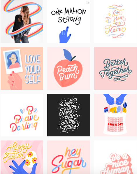
When sharing your work, try to be consistent! A little bit of consistency goes a long way and can help your followers recognize your work faster. Consistency also makes your feed feel more unified and put together. Try to be consistent about the overall visual feel of your posts. Are your posts light or dark? Are they bright or neutral? Are they warm or cool? Here are a few examples of a few of my friends who are very good at this. Tayler Mitchel uses consistent colors in all her posts, which gives it a very unified feel. Melissa Esplin always has bright, clean neutral photos with pops of color. Jody Tellier has a very sophisticated feeling feed with lots of green, gold and textures. My feed is pretty bright and has a lot of blue and red (my brand colors!) sprinkled thought.
Tayler Mitchell @taylermitchell
Melissa Esplin @melissapher
Jody Tellier @somedayartco
Hayley Barry @typeaffiliated


